Using AAC to help a child begin using YES and NO, with and without their device.
Yes/No
a multi-sensory approach
Despite the fact that TT hit the ground running with AAC, one thing that still remained as difficult as it had with PECS was her ability to use the words YES and NO on a regular basis. A lot of kids like her don't see the need for these words...if they want something, they'll let you know! Many autistic kids become very adept at getting their needs met through non verbal means. This means the focus is on things they WANT, and you don't need to ask them because they are already showing you that, YES, they WANT that thing!
No can seem unecessary to them. I've often thought that from TT's perspective, it's pretty much all a NO unless she is SHOWING you otherwise. So the whole concept of a binary yes/no for things has taken time and work. For us, the breakthrough came when we began using her talker, as well as when we began using physical signs for yes and no.
TT does not shake her head yes or no, despite seeming to understand what we mean when we do that. But what she does understand is using a thumbs up or thumbs down. She both understands it, and now does it herself. We use the physical thumbs up for GOOD, LIKE, as well as YES - which may seem confusing, as the talker has 2 separate graphics - but we've found that she doesn't have any trouble.
We use the physical thumbs down for BAD, DON'T LIKE, as well as NO. We had fun with that one day, and the other 2 kids and I took her to the Anchorage Museum, and asked her to rate each painting - a LIKE or NO LIKE. She seem to understand the goal quite well, and gave us some surprising answers!
yes/no chooser
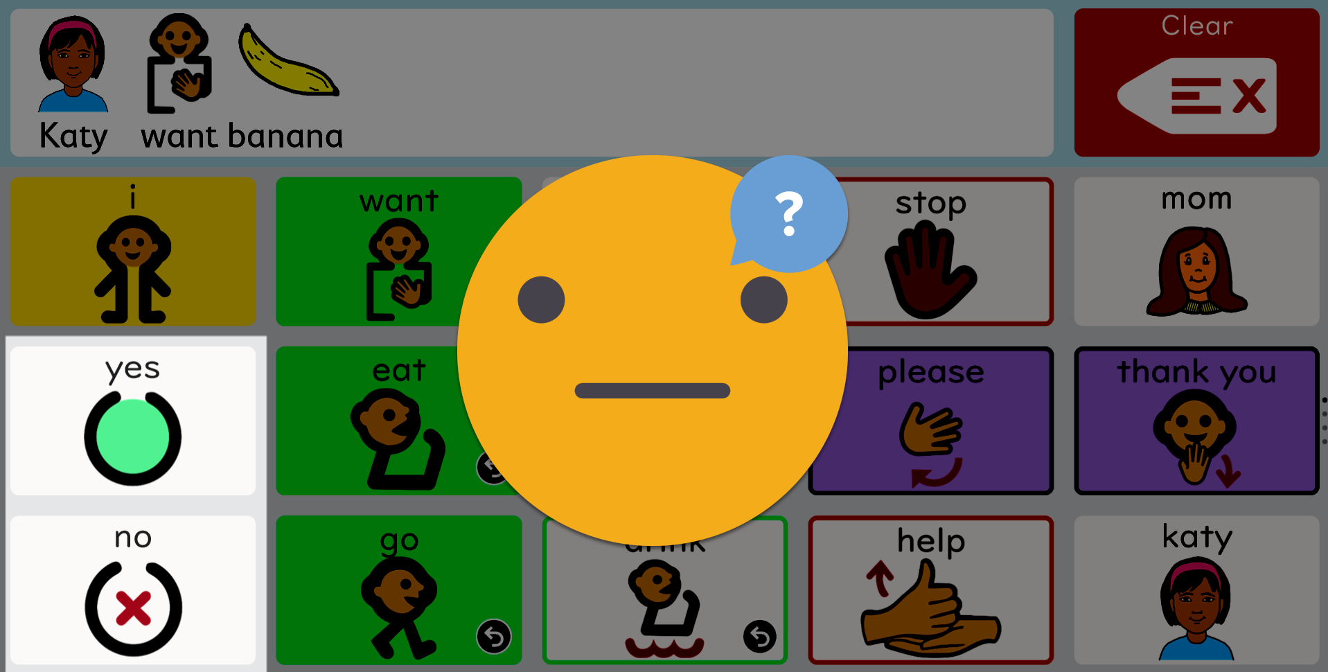
When we first set up the Talker, our SLP wanted me to put buttons for YES and NO on the homepage. That meant that of the 15 buttons, 2 were supposed to be dedicated to words that TT did not really use. Caramba! And sure enough, despite putting these buttons on the homepage, she did not use them. And when asking her questions, she wouldn't click these buttons to respond unless I did hand over hand. Here is an example of a setup that did not work very well.
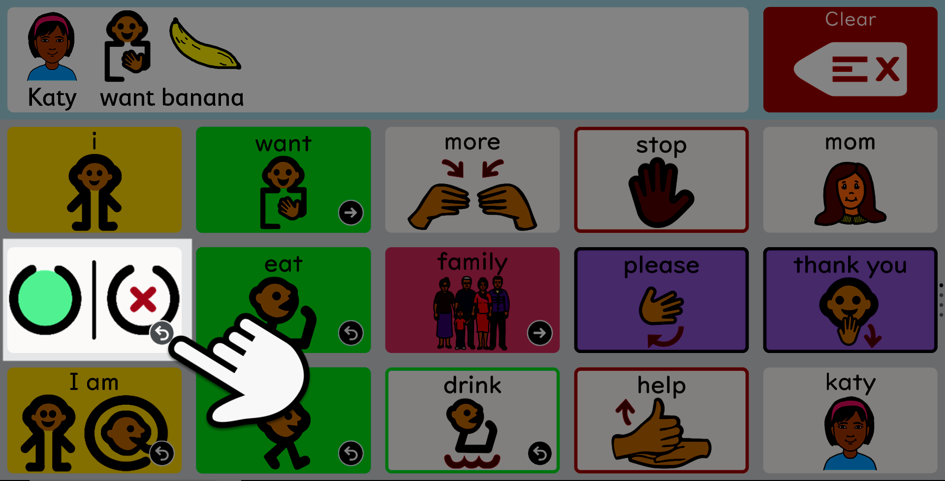
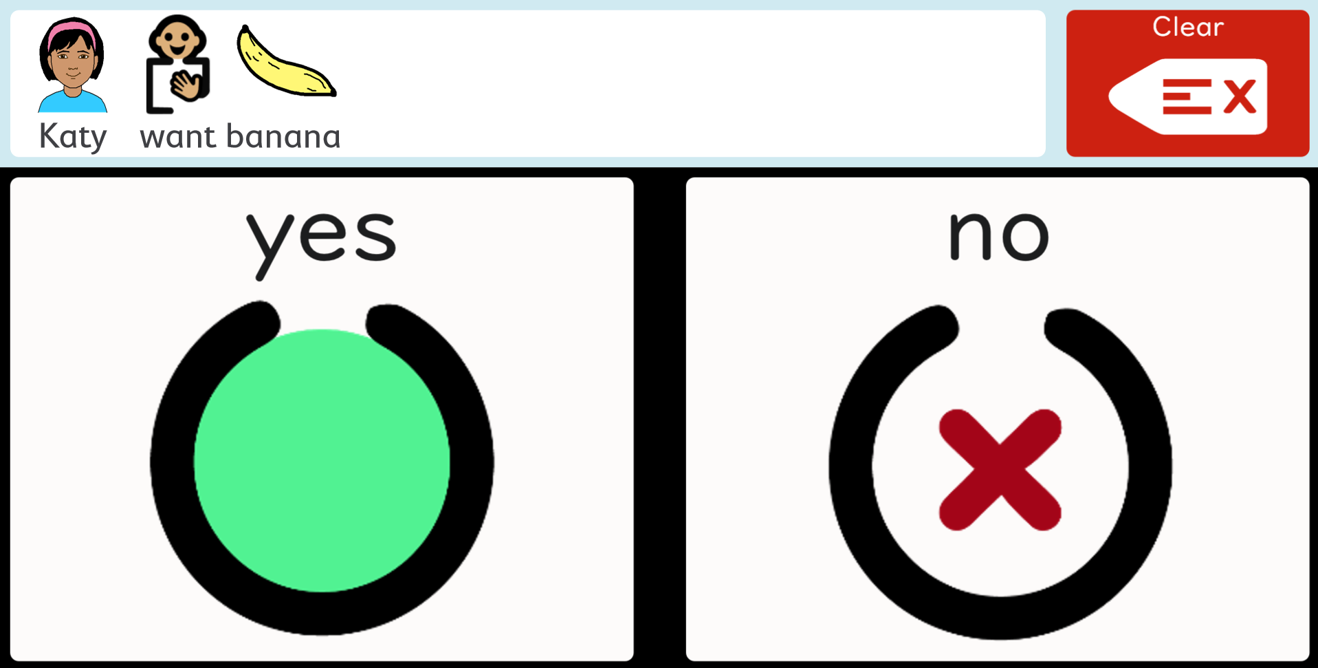
When I changed the page, and began clicking on the YES/NO button and bringing up the choice page, it did not take TT long to learn how to choose the one the corresponded with her feelings
.
Why these icons?
Visual language development
You'll notice that I use the graphics from our custom AAC icons for YES and NO, and not the standard PCS ones that are commonly used. It's worth explaining, because it illustrates my attempt to present visual building blocks for language, rather than one off images. First let's look at the standard YES/NO graphics found in most Core AAC setups.
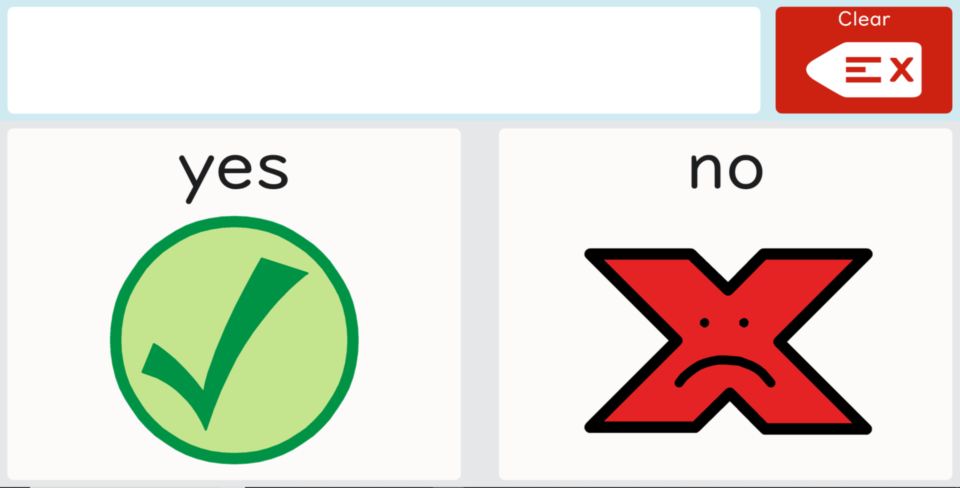
One thing that is vital to remember is that a child learning AAC does not necessarily have any pre existing knowledge of abstract signs and their meaning. So, for example, the check mark versus the "X" sign may have no meaning to them whatsoever. Upon first seeing such a sign, they will rely on clues such as the color, shape, and in the case of the "X", the fact that it has a little frowny face in there. That's it.
While kids may have seen a check versus an "X" in apps they may have used, in those cases these graphics would have slightly different meanings, which could confuse the child further. A green check mark often means "completed" in apps, and the red "X" means you have the incorrect answer. In AAC, when the child does not want someothing, NO is indeed the correct answer.
I would argue that the PCS graphics for YES/NO fail on a variety of levels.
- There is no visual relationship between the 2 graphics
- "NO" is seen as a word that is associated with negative or sad feelings
- The icons are 1 off; unrelated to a larger system of language
Learning language through AAC is tough. Literacy rates among nonverbal AAC dependant people are terrible. Really terrible, around 10%. So I feel it is absolutely vital to use graphics that can serve as building blocks for langauge, and later literacy, as opposed to 1 off graphics that the child must learn just for AAC, and then learn again as they move towards using words instead of symbols.
By choosing graphics that don't fit into a larger system of language, you are forcing the child to do more work. Or sadly, as is the case for many people, you may be doing down a road where you've made literacy that much harder, without meaning to.
Now let's take a look at our YES/NO icons, and see why they might be better.
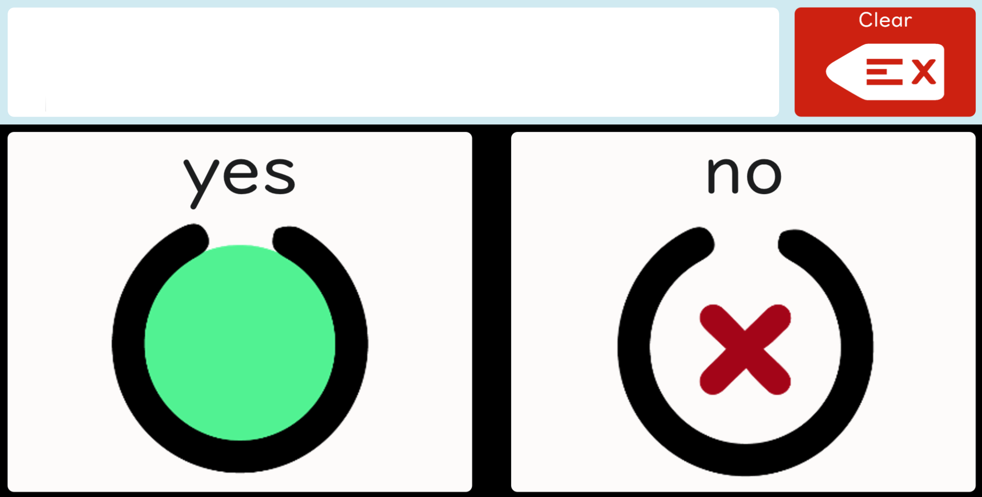
- There is a visual relationship between the 2 graphics
- "NO" does not have a negative connotation
- The red "X" is used throughout our symbols to indicate null or not existing
- Both symbols fit into a larger system of visual language
I am not trying to point the finger at all of the wonderful SLP's and ABA therapists who have used PCS symbols with great success over the years! However, I do think that developing a truly visual language block system for AAC and PECS would help combat the "Chinese Kanji" problem where you are simply asking too much of the child, via presenting graphics that must be learned and remembered 1 by 1. In ancient China, in order to truly master written speech, they had to memorize some 50,000 individual Kanji graphics! The development of phonics based systems made literacy open to all rather than a select few.
As many autistic and/or apraxic children do not have strong access to phonological processing (hence the need for the AAC to begin with...), developing visual language skills could be one of the keys to helping break the literacy barrier. I'm working on a program called Learn to Read Visually, which couples letters with shapes and colors in order to help replace phonics, and allow for truly visual mapping of letters. I'll be writing much more about that later as I put some of the activities online that I'm currently testing out with TT.
AAC needs to do better if we are to help more children bridge the gap to true literacy, and developing graphics that link together in a larger system is one step we can take.
Downloadable Graphics
Right click and select "Save Image As" to download any image below. To download a zip file of these images, click here. Copyright © Stacey Reiman 2019, free for non-commercial use.


